Email Marketing
4 Call to Action Tactics to Drive Clicks
Jun 19, 2015

Are your email newsletters driving the results you need?
If you’re experiencing low click-through rates, the issue could lie in your calls to action (CTAs) tactics. Every email you send needs to present compelling, high-value content to your readers, with a clear invitation to click-through to your website and continue your conversation.
While you should provide multiple avenues for your contacts to engage, a primary CTA should clearly draw your readers into taking some action, such as downloading an eBook, viewing your new products, or subscribing to your blog.
Common call to action tactics found in emails include failing to include a prominent button, page positioning, and too little sense of urgency in button language. This can result in confusion, frustration, and most commonly, poor results or triggered spam algorithms.
Check out the following best practices for highly enticing CTAs:
1. Use HTML
Some marketers with limited technological savvy may choose to upload and link images to emulate the appearance of a button in their newsletters. Up to 60% of mobile devices and browsers turn off images by default, and your contacts may not choose to turn images on to view your content.
Building HTML buttons that will appear on every mobile device or browser doesn’t necessarily require sophisticated technological savvy. Some email marketing platforms, including FlashIssue, offer drag-and-drop functionality so you can create fully customized HTML buttons and other features without ever having to wade into code.
2. Employ Active Language
As an email prospect, which of the following CTA buttons would appeal to you more?
A Link to Our eBook
OR
Download Your eBook Now!
If you’re anything like the majority of consumers, you’d select the second option. Active language inspires action, and your call to action tactics should provide unambiguous direction to your contacts.
Keep your CTA text brief, relying on no more than 1-4 words to get the point across. Strive for both urgency and clarity. Most importantly, rely on action-oriented language, like “download,” “click,” “learn,” “buy,” or “shop” to see results.
3. Optimize Your Placement
With some rare exceptions, your CTAs should be center-aligned and highly visible. Many marketers believe that keeping your button above-the-fold on a desktop device is optimal, though this isn’t always easy to achieve. Regardless, your button shouldn’t be buried in a link or located at the bottom of your email.
Not sure how your emails will appear to prospects after you send? Many email marketing tools, including FlashIssue, allow you to preview your email on mobile or desktop device while you’re still in design mode!
4. Go Bold with Color
The highest-performing email newsletter call to action tactics stand out clearly. Most often, this is achieved through the use of bright colors. Bright orange, red, blue, and green are all colors that perform extraordinarily well as the background for CTA buttons. Don’t worry if it appears slightly disruptive to the flow of your email, that’s the goal.
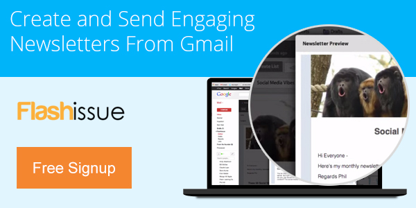
To test drive FlashIssue’s easy-to-use HTML editor and start using the best call to action tactics, check out our library of free email newsletter templates today!
Continue reading