Marketing Hacks
Design online ads in minutes using this growth hack
Apr 30, 2015
I stumbled on this growth hack that allowed me (a non-designer) to design cool online ads in minutes without needing any design skills. I use them in Facebook and email campaigns.
I’m working on a new project to test the concept of a reading app for kids. I tend to follow the standard lean approach, so my starting point was to set up a landing page on unbounce.com and drive traffic to it via Facebook ads and email.
Designing ads for online campaigns can be a pain and it’s certainly outside my skill set, so I hit on this quick hack that enabled me to churn out some pretty good looking ads quickly.
I avoided touching Photoshop or any design software because they confuse me. The only tool / skill I needed was the ability to throw up a stock webpage on the DIY web builder squarespace.com – any website builder like weebly or wordpress (free) will also work.
Ingredients list to design an online ads in minutes :
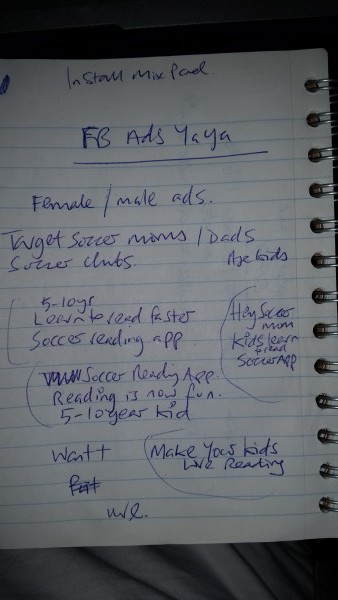
- Ad copy variants with headline and bye lines e.g. <h> Reading is now fun <h2> Soccer reading app for 5-10 yrs <CTA> Get Free App
- A webpage on squarespace.com
- Screen capture tool (cmmd + shift + 4 on mac is easy and free)
- Page Ruler plugin for Chrome (nice to have)
Step 1 Design Online Ads:
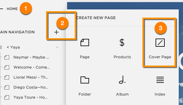
Set up your webpage
Set up your webpage with a clean image headline and bye line and call to action. I used squarespace to set up yayasoccer.com using their Cover Page page. Not only was this fast but the page runs through a slideshow of back ground images that means i can create numerous different ads in seconds.
Tip: Use a web page that has a background image that takes up the entire page. The template MUST be responsive i.e. the page automatically resizes and formats it self to the device reading the page.
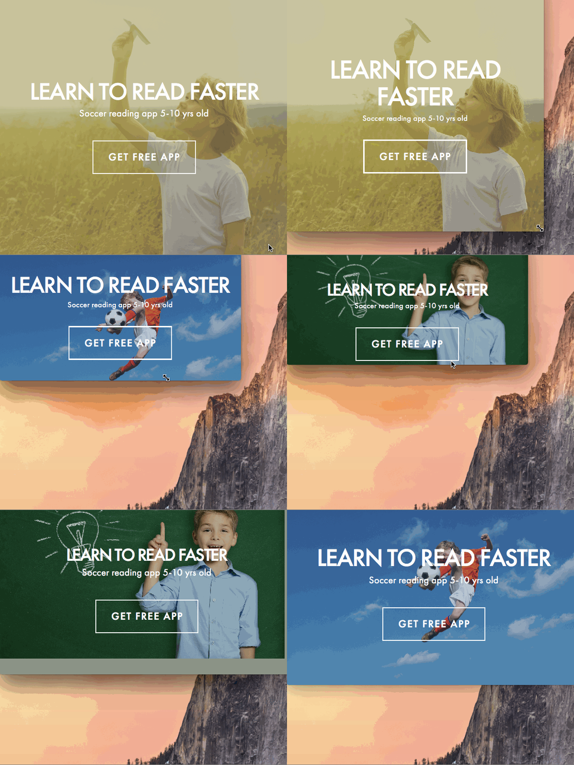
Once I created my page it looked like this:
You can see this running on Yayasoccer.com

Created an animated .gif like this
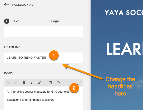
With the Cover Page template I’m able to quickly change the headlines and text which will be necessary to create my advert variants.
Step 2 Design Online Ads
Set up your ad messages:
An online ad usually has three components
- The headline-1 (the benefit statement)
- The headline-2 (the feature statement)
- The Call To Action CTA (what you want the reader to do)
I created a number of variants to test in my ads:
When I publish my page with these variants in the message fields I ended up with this live webpage:
Step 3 Design Online Ads
Generate your ad images
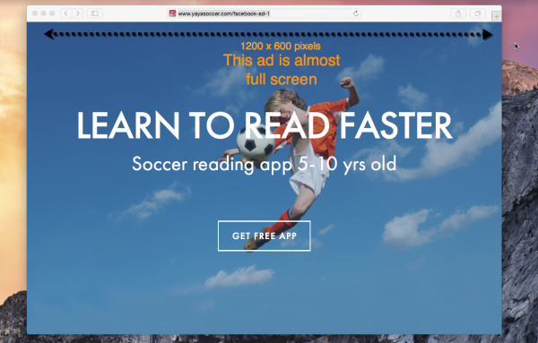
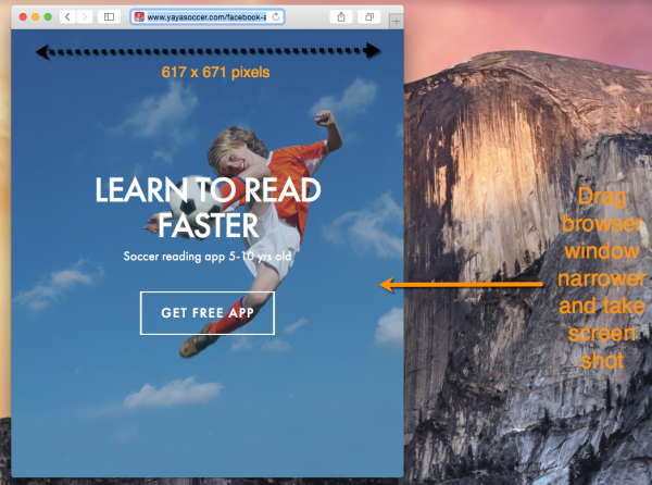
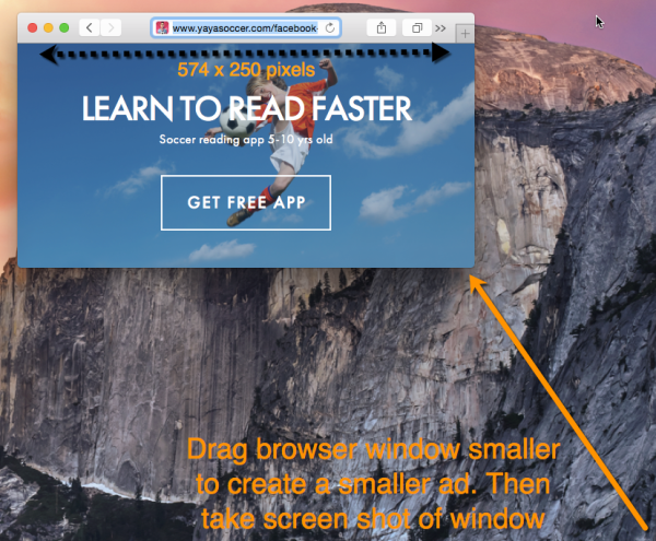
Now for the fun bit. By resizing my browser window to the size of my desired ad all I need do is take a screen shot of the page to generate my ad.
Since the webpage is responsive all the text and images will resize automatically to fit the size of the ad you want.
Lets say I wanted an ad with the dimensions 600×400 pixels. All I need do is drag my browser window to the appropriate size and take a screen shot of the browser window.
The output of the screen shot will be an image file. This image file is my ad.
Large ad
Medium ad
Small ad:
Step 4 Design Online Ads
Using your image in an ad
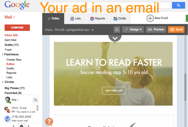
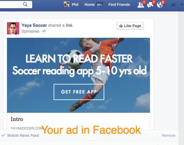
I then use my image in my Facebook and email marketing campaigns:
Embedded in an email:
Used in a Facebook Ad:
Continue reading

