Flashissue News & Tips
FlashIssue Flashback
May 21, 2012
 This is the second post in a new series from the team at FlashIssue. This time around, it’s Thomas Lodato who is in charge of making FlashIssue look good and be super easy to use. Here is his take on some of the changes we’ve made over the past couple of weeks:
If you have been using FlashIssue over the last two weeks, then you probably have noticed some significant changes to the look and feel of the our web app for creating curated newsletters. An easy drag-and-drop newsletter creator is our primary concern but a smooth user experience comes a close second. To help you better understand how and why the look has changed, let’s go through what changed (and plan to change) with FlashIssue.
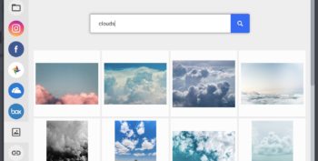
Check out the before and after pics:
Before:
The most noticeable change to the web app is an overall restyling.
Most people associate newsletters with office drudgery: grey cubicles, TPS reports, and endless copyediting. We restyled the interface to be whiter with softer tones and more subtle gradients. We tightened up the typography and cleaned up the background. We just wanted to make sure that FlashIssue looks more like it feels to use; which is fun, easy, and a breath of fresh air.
Another big improvement is simplified styles.
By removing excess color, you can focus more keenly on content curation. The principle is one we borrowed information visualization wizard Edward Tufte. By removing a good deal of distracting pixels from FlashIssue’s interface, you’re able to focus on your task–making a newsletter, fast! These style changes carry over to the newsletter itself, giving your curated content preference.
The other big change is Facebook-style link text editing.
Sometimes the snippet we grab is pretty wonky. We try our best, but things happen with some websites that are formatted differently. Now, by clicking the editing button for each post, you can summarize the article in your own words. You can remove the picture and edit the title as well!
A few more things…
- We reordered the buttons at the top of the newsletter panel. Now there will be no more accidentally deleted newsletters when you want to save. We added a new UserVoice feedback widget so we can find out what you think.
- More hidden from view, we changed the way articles load so feeds will populate faster and fixed the email template to be more uniform across email service providers.
- Lastly, we remade the email template so there are fewer formatting differences across email service providers and desktop clients.
Coming Soon
- Add your own message between articles
- New template options
I’d love to hear what you think @FlashIssue
– Thomas
Continue reading


